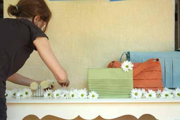
I’ve been meaning to share a bit of the process involved in making 1, 2, 3 Sew, and I’m finally getting around to it today. This method is different for every author and varies with different publishers, but the making of 1, 2, 3 Sew was a hands-on DIY project.
For many craft book authors, the job ends after you have written the text and sewn the samples, at which point you box up the projects and send them off to be photographed. But working with Chronicle Books, I had the freedom to get much more involved in the process. I created all of the illustrations, styled the photos, and sewed the backgrounds for the chapter openers. When you are writing a craft book, it’s important to realize that the final look and the cover of the book–along with any editing decisions–are ultimately up to the publisher. I am thankful to my editor and the designers for listening to my input, which I think helped make the book my own. I know that I drove them crazy in the process.
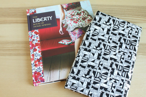
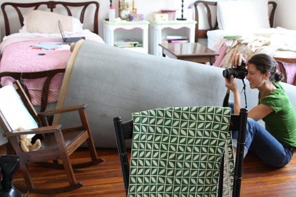
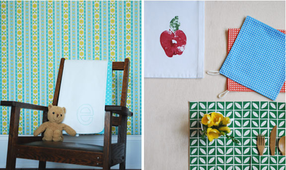
First, my friend Laura Malek and I tore apart my house so she could take the photos. The picture above was me trying different ideas for covers, none of which made the cut. I did include flowers in many of the photos, because I really love them. Below is a photo of Laura in my older daughter’s room, which has the best light in the house. So the wall was painted at least three times to make different backgrounds. We rolled up the rug, moved around furniture, painted and tiled backgrounds and scavenged for props. Here, we were using vintage wallpaper glued to plywood and nailed to the wall to achieve the photo of the Initial Blanket, as shown below. You can see the table runner draped over the chair, as Laura had just finished taking the other photograph that would be the opener for the Dining and Dishes chapter.
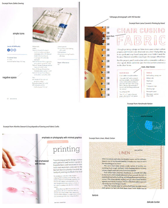
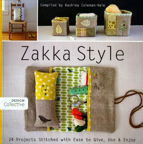
After we shot and re-shot the photographs with Laura being the most patient person in the world, it was time for the layout and design of the book. Actually, the designers at Chronicle had already started working on this with some sample photos. The Design Director, Aya Akazawa, and the designer, Vivien Sung, came up with some amazing ideas for the design and layout of the book. First, I sent them some of my own ideas (naturally). I love simple designs and negative space, the handmade look of imperfect, sketchy illustrations and the clean design of easy-to-read fonts. So I sent in some of these ideas reflected in other books. Below, I highlighted some of my favorite elements from Zakka Sewing, Printing by Hand, Martha Stewart’s Encyclopedia of Sewing and Fabric Crafts, Handmade Nation and Linen, Wool, Cotton.
Next, the design team came up with some possible ideas for chapter openers, along with layout designs.
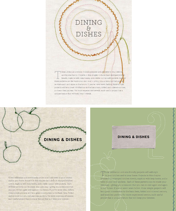
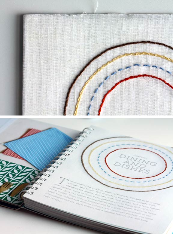
I loved Vivien’s ideas and the fact that she took the initiative to sew and photograph some design possibilities. While I adored the handmade look of these sewn options, I felt that a more finished sewn design would better suit my style. So they sent over her drawings for each chapter opener and I sewed them on white linen with heavy-duty interfacing. I then attached the fabric to cardboard and photographed the backgrounds on my front porch with a macro lens. Below you can see a detail of the embroidery, as well as the final version in the book with text overlayed.
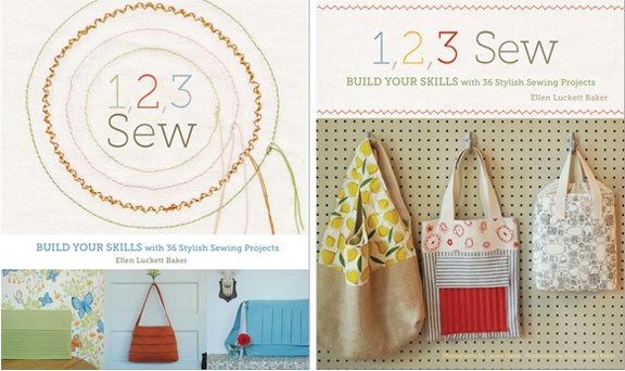
Then there was the cover decision. I have to admit that I spent way too much time obsessing over the cover. The truth is that the cover is often determined by those in the marketing department who know what sells best, and you have to trust them. I’ll be better at this the next time around. They wanted to show the concept of 1, 2, 3 Sew and how each project builds on the skills learned in the project before. This proved somewhat difficult to do visually, so the design team came up with the idea of the arrows and wanted to show three projects from one chapter so you could visually see the progression. Here are just a couple of preliminary drafts that they sent. You can also see that the subtitle and number of projects changed.
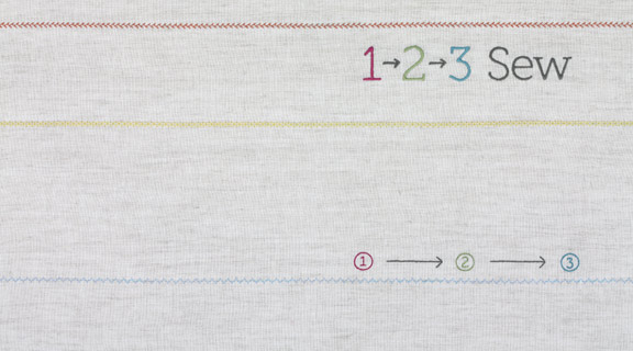
And of course, I wanted to make some more work for myself! So I decided to digitize the title design for machine embroidery, sew it on natural linen, and photograph it. I wanted texture on the cover, but I’m afraid this gets lost in a digital, online image. It’s so much better when you’re holding the book in your hands. I sewed out the design and then sent them this image (in much higher resolution):
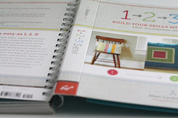
And they made it into the wrap-around cover that you see now:
It makes me tired just thinking about this process, and I hope that I’ll be able to step back from it more this time around. But ultimately, being involved in every step helped make the book my own, and I’m proud of the finished result as well as the hard work that went into it. As anyone who has written a craft book can attest, there’s a bit of yourself poured into the book. And I’m blaming 1, 2, 3 Sew for the new patch of gray hair on my head.
